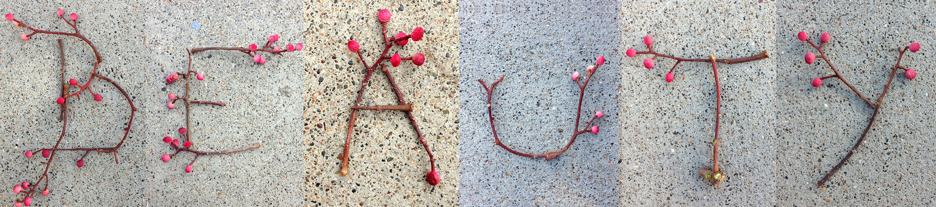
Beauty is everywhere, but not everyone can see it.
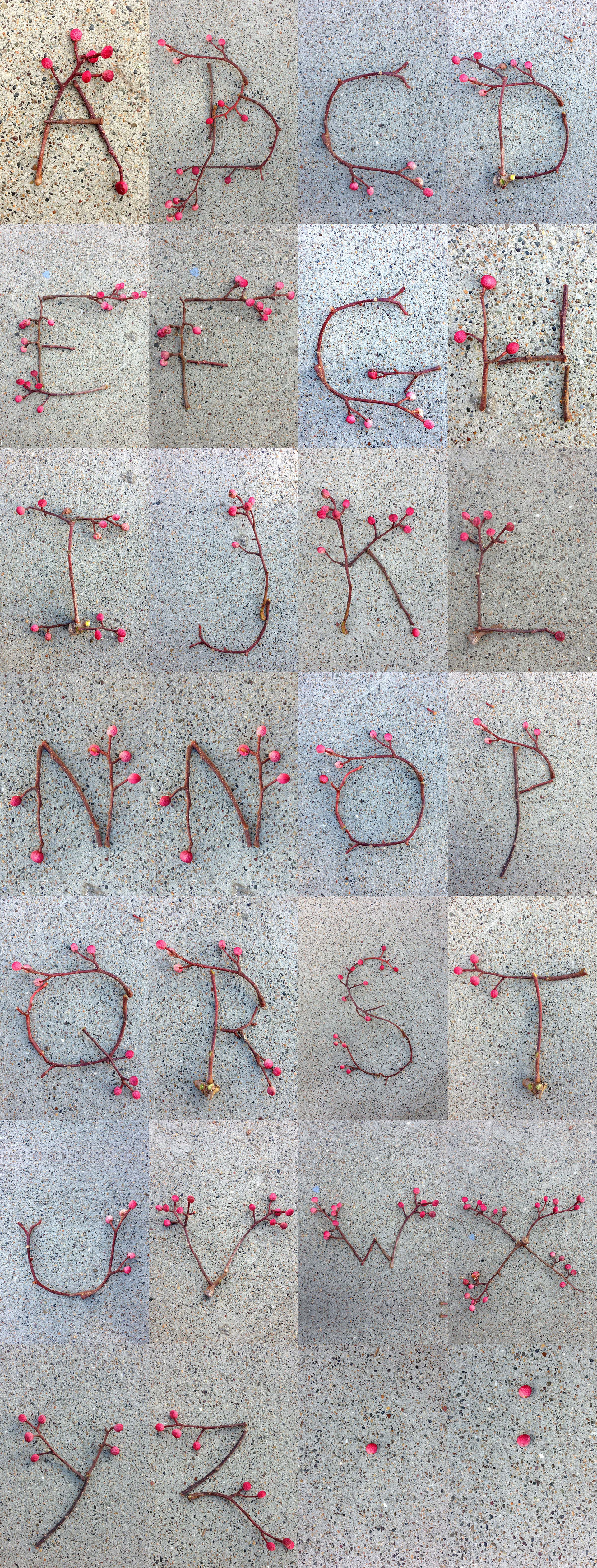
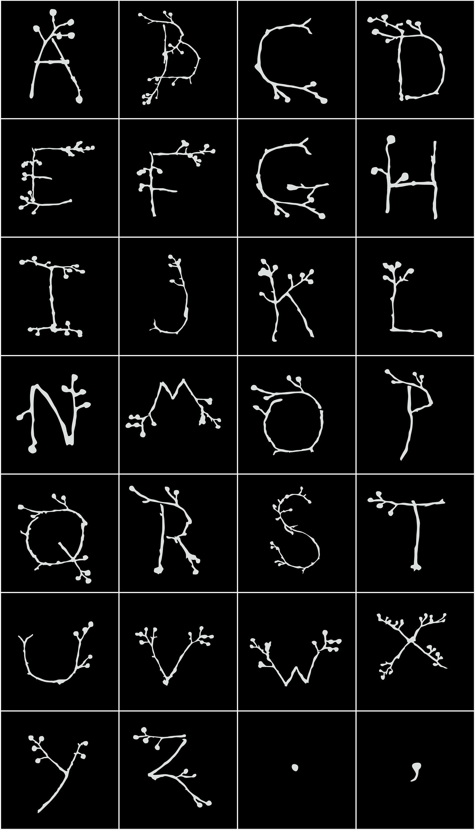
An exploration of nature and typography. Each letter of the alphabet has been crafted using fallen branches collected from the vibrant streets of San Francisco. This interplay of natural elements and urban discovery has culminated in a unique alphabet that speaks to the inherent elegance found in the city's untamed, organic materials.
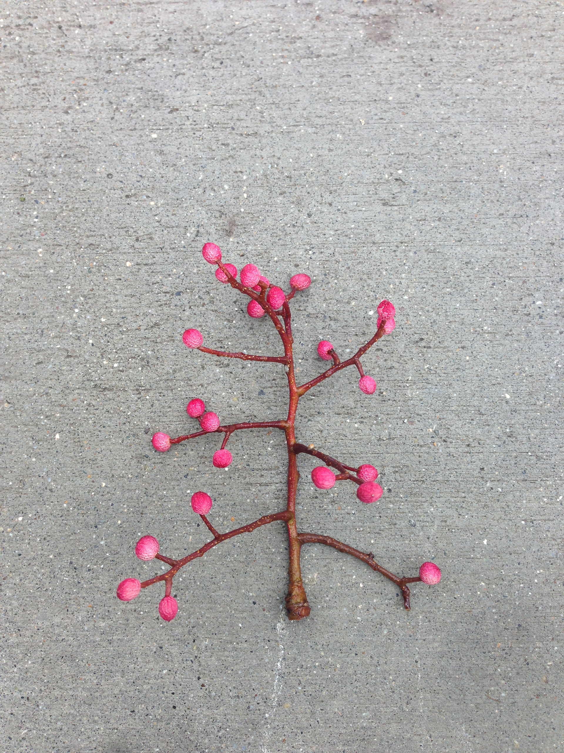
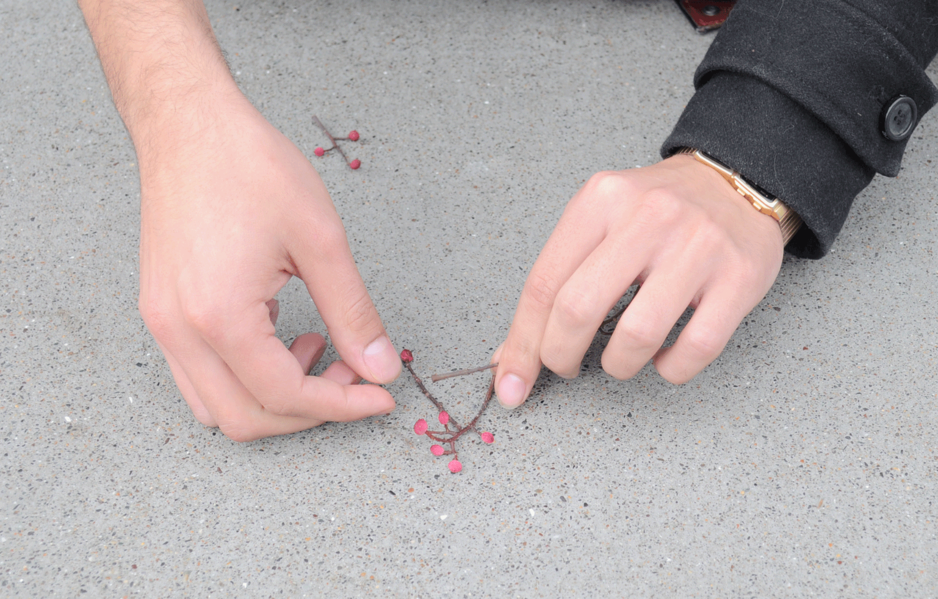
These branches, which once reached towards the sky, now find a second life, meticulously arranged to give form to language. As we gathered and assembled these natural artifacts, our design process became a meditative dialogue with the environment—a narrative of repurposing and reimagining the mundane into art.
This alphabet stands as a testament to the philosophy that design need not rely on the creation of new materials but can instead reveal the new within what is already given. It challenges us to perceive our surroundings with a keener eye and to appreciate the potential for art in every stray twig and every wind-tossed bough. Our hope is to inspire others to look beyond the conventional and recognize the aesthetic potential that lies dormant in our everyday life.
Through this project, we invite viewers to engage with the alphabet not just as a tool for communication, but as a visual symphony of the natural world and with our urban experience. In the fall branches of San Francisco, we discovered more than mere debris; we found the building blocks of a unique visual language that resonates with the city’s spirit of innovation and creativity.
Creators: Daniel Gomez, Ashley Jobe and Marco Guadarrama